
Imagine entering a room where every hue, every shade speaks to your senses, creating an atmosphere of luxury and harmony. This is the power of using the right color palette in interior design. In this article, we’ll explore how to harness colors to transform your space, reflect your personality, and enhance the luxurious feel of your home.
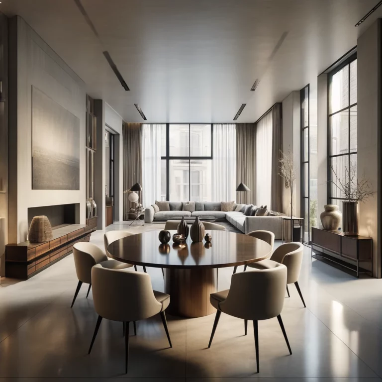
Colors are more than just visual elements; they evoke emotions and set the mood. Think about the calmness of ocean blues or the warmth of earthy tones. In luxury interiors, understanding the psychological impact of colors is crucial. It’s about choosing shades that not only look stunning but also resonate with the emotions you want to evoke in each room.
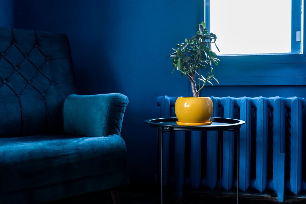
The choice of color is deeply influenced by the space it occupies. A compact room can be made to feel spacious with light, airy colors, while darker tones can add a touch of intimacy to larger areas. Here, we delve into how the interplay of color and space can create a visually stunning and balanced environment.
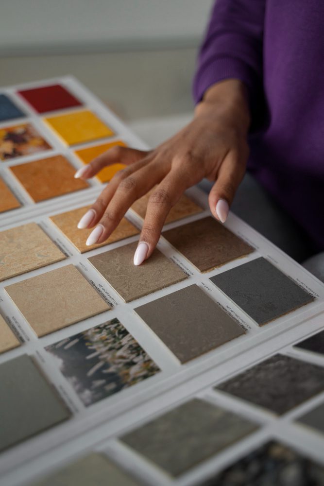
Stay ahead of the curve with the latest color trends. This year, we’re seeing a blend of bold and subtle combinations, each bringing a unique vibe. From the classic elegance of monochromatic schemes to the daring contrast of complementary colors, learn how to integrate these trends into your luxury interior.
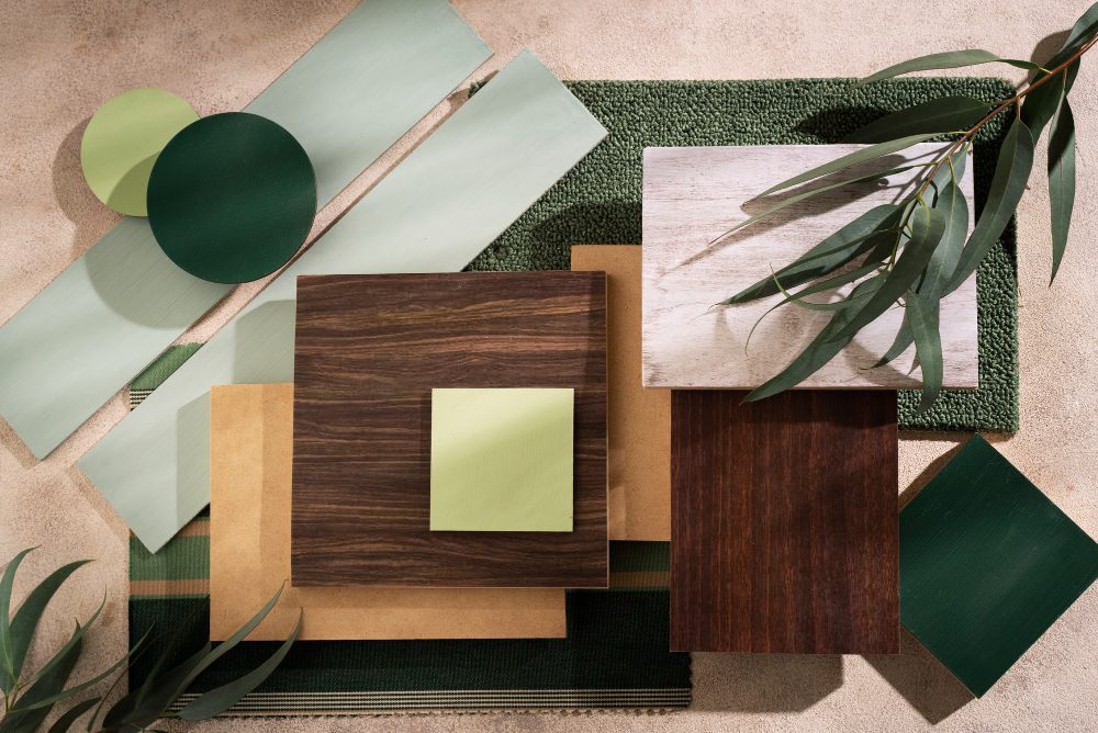
The magic of textures – Fabric, silk, or brushed metal – can elevate the perception of color.
They add depth, contrast, and an element of tactile luxury. Here, we’ll show you how to pair textures with colors to create a rich, multi-dimensional look in your interior design.
Accent colors are like the final brushstroke on a masterpiece, completing the look. Whether it’s a bold piece of art or a subtle throw pillow, these pops of color can transform a room from beautiful to breathtaking. We’ll guide you on how to choose and place accent colors for maximum impact.
In the world of luxury interiors, the balance between timeless elegance and contemporary style is key. We explore how to mix classic colors like black and white with trendy hues to create a space that is both modern and enduring.
To select a color palette that mirrors your personality while retaining a luxurious feel, start by identifying colors that resonate with you personally. Mix these with neutral tones that exude elegance. For a unique touch, incorporate subtle accents in your favorite hues. Balance is key: your personal colors should enhance, not dominate, the luxury elements.
A frequent mistake in luxury interiors is overusing bold colors or creating too much contrast, which can lead to visual chaos. Avoid saturating your space with too many different colors. Instead, focus on creating a harmonious flow. Another pitfall is neglecting the impact of lighting on colors, which can significantly alter their appearance in a room.
To incorporate bold colors without overwhelming the space, use them as accents rather than primary colors. Consider applying bold colors in smaller elements like cushions, art pieces, or a single accent wall. This approach allows for a pop of color without overpowering the overall design aesthetic.
Yes, mixing warm and cool colors in a luxury interior can create a dynamic and balanced look. The key is to find the right proportion and placement. For instance, cool blues can be warmed up with rich gold accents, or a warm, earthy wall can be complemented with cool, metallic accessories. The mix should feel intentional and cohesive.
When using metallic colors in interior design, consider them as accents to add a touch of luxury and sophistication. Metallics like gold, silver, and bronze work well with a variety of color palettes. Use them in light fixtures, decorative items, or furniture details. Be mindful of not overdoing it; a few well-placed metallic elements can make a bold statement without overwhelming the space.